- All
- Product Name
- Product Keyword
- Product Model
- Product Summary
- Product Description
- Multi Field Search
Views: 0 Author: Site Editor Publish Time: 2025-06-03 Origin: Site


Slate blue is a cool color. It mixes soft blue and gentle gray. This mix makes it look calm and fancy. You see it between blue and gray on the color wheel. This spot gives it a balanced feel. Many design experts say slate blue is peaceful and useful. You can use it to make rooms feel calm. It works well in offices, bedrooms, or bathrooms. It looks nice with a modern wash basin or a sleek bathtub. This color goes well with bold and neutral colors. It is a smart pick for stylish rooms.
Slate blue mixes soft blue and gentle gray. It makes a calm and fancy color. This color is great for homes and offices.
You can use this color on walls, cabinets, and bathroom fixtures. It helps rooms feel peaceful and look nice.
Slate blue has many shades. Some are light and airy. Others are dark and bold. You can pick the right mood for any room.
Try slate blue with white, yellow, sage green, or deep purple. These colors look good together and make nice designs.
Knowing slate blue’s color codes (HEX #6A5ACD, RGB, HSL) is helpful. It lets you match the exact shade in digital and paint projects.

Slate blue color looks soft and not too bright. It mixes blue with gentle gray, and sometimes a little purple. This color feels calm and fancy. It is different from bright blue shades. Slate blue color does not try to stand out. It makes a room feel peaceful and quiet. You might see it in a modern bathroom. It could be on a wall behind a wash basin or as a small accent in a living room.
Designers like slate blue color because it looks special. It feels new but also classic. The color comes from slate stone, which makes it look strong and old-fashioned. Slate blue color comes in many shades. Some are light with a bit of lavender. Others are dark blue with gray mixed in. Each shade gives a different feeling, but all feel calm and fancy.
Tip: If you want a room to feel calm and nice, use slate blue color on walls, cabinets, or even your bathtub. This color looks good with both bright and plain colors.
You can spot slate blue color by these things:
It mixes blue with soft gray and sometimes purple.
The color looks soft, not bright, and fancy.
Slate blue color makes a room feel calm and peaceful.
It is not like bright blue because it looks quiet and nice.
The gray in it makes the blue softer and deeper.
Slate blue color feels classic and strong, so people use it in homes and offices.
Here is a table that shows how slate blue color is different from other colors:
Color Name | Main Undertones | Mood Created |
|---|---|---|
Slate Blue Color | Blue, Gray, Purple | Calm, Elegant |
Dusty Blue | Blue, Gray | Soft, Relaxed |
Periwinkle | Blue, Lavender | Playful, Light |
Gray-Blue | Blue, Gray | Cool, Subtle |
Some people think slate blue color is just blue, but it is more than that. Many people mix it up with simple blue, but the gray in it makes it special and moody. This makes slate blue color work in many styles, from new to old.
In stores and offices, you see slate blue color in tiles, floors, and walls. Hotels, restaurants, and offices use this color to look nice and friendly. Slate blue color is good for busy places because it hides dirt and still looks good.
If you want to change your bathroom or kitchen, try using slate blue color in a new wash basin or bathroom set. This color looks great with steel, granite, and other modern things. You can make your space look new and classic at the same time.
Note: Slate blue color is not just for beach or boat themes. You can use it anywhere you want a calm and fancy look.
You might want to use slate blue in your digital designs or home projects. To do this, you need to know its color codes. These codes help you match the exact shade every time. The most common codes for slate blue are HEX, RGB, and HSL. Each code works best for different uses, like web design, graphic work, or paint mixing.
Here is a simple table that shows the main color codes for slate blue:
Color Format | Code |
|---|---|
HEX | #6A5ACD |
RGB | (106, 90, 205) |
HSL | (248°, 53%, 58%) |
HEX: You use this code for websites and digital screens. Type #6A5ACD to get the true slate blue color.
RGB: This code shows how much red, green, and blue mix together. For slate blue, use (106, 90, 205).
HSL: This code stands for hue, saturation, and lightness. Slate blue uses (248°, 53%, 58%).
You can use these codes to make sure your wash basin, wall paint, or even your website matches the real slate blue shade. If you want your bathroom vanity or kitchen sink area to look modern, these codes help you get the right color.
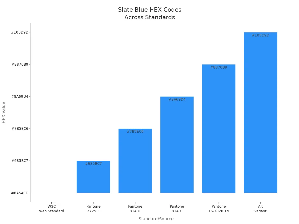
You may also see slate blue listed in different color standards. The W3C web standard uses #6A5ACD. Pantone, a popular color system for printing and design, has several close matches. The closest Pantone code is PANTONE 2725 C, which is 99% similar to the web standard. Other Pantone codes like 814 U and 16-3828 TN also come close.
Here is a table comparing slate blue across different standards:
Standard/Source | HEX | RGB | HSL (Hue°, Saturation%, Lightness%) | Notes/Comments |
|---|---|---|---|---|
W3C/Web Standard | #6A5ACD | (106, 90, 205) | (248°, 53%, 58%) | Official web color definition |
Pantone 2725 C | #685BC7 | N/A | N/A | 99% similarity (closest Pantone match) |
Pantone 814 U | #7B5EC6 | N/A | N/A | 96% similarity |
Pantone 814 C | #8A69D4 | N/A | N/A | 92% similarity |
Pantone 16-3828 TN | #8870B9 | N/A | N/A | 89% similarity |
Other Variant | #105D9D | (16, 93, 157) | N/A | Different slate blue variant |
Note: If you want the closest Pantone match for printing, use PANTONE 2725 C. This helps you get a color almost the same as the web version of slate blue.
You can see how these HEX codes compare in this chart:
Slate blue comes in a few different shades. Each one has its own code and look. You might see names like "Medium Slate Blue" or "Dark Slate Blue" in design tools or paint catalogs. These variations let you pick the perfect shade for your space, whether you want a lighter wall behind your bathtub or a deeper color for your office.
Here is a table showing some common variations:
Color Name | Hex Code | RGB Values | CMYK Values | Description |
|---|---|---|---|---|
Slate Blue | #6A5ACD | 106, 90, 205 | 48, 56, 0, 20 | The classic slate blue, named after slate stone. |
Medium Slate Blue | #7B68EE | 123, 104, 238 | 48, 56, 0, 7 | A brighter, more lively version with extra blue and a hint of purple. |
You can use these variations to create depth in your design. For example, try medium slate blue for an accent wall and classic slate blue for cabinets or a wash basin. This mix gives your room a modern and layered look.
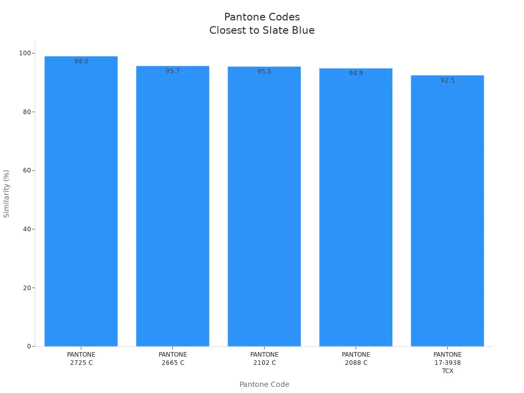
Pantone also lists several codes that come close to slate blue. The closest is PANTONE 2725 C, with a 99% similarity. Other Pantone codes like 2665 C and 2102 C are also good matches. Here is a quick look at how close these Pantone codes are:
Pantone Code | Color Type | ΔE Value | Similarity Percentage | Notes |
|---|---|---|---|---|
PANTONE 2725 C | PMS | 1.03 | 99.0% | Closest match to Slate Blue (#6A5ACD) |
PANTONE 2665 C | PMS | 4.33 | 95.7% | Close match |
PANTONE 2102 C | PMS | 4.50 | 95.5% | Close match |
PANTONE 2088 C | PMS | 5.09 | 94.9% | Close match |
PANTONE 17-3938 TCX | TCX | 7.51 | 92.5% | Closest TCX match (Very Peri) |
You can see the similarity percentages in this chart:
Tip: When you choose a slate blue paint or tile for your bathroom or kitchen, check the color code. This helps you get the exact shade you want, whether you use it for a modern wash basin, a stylish bathtub, or a kitchen sink area.
You can find many shades of slate blue, each with its own look and feel. Some shades of slate blue appear light and airy, while others look deep and bold. Light slate blue has a HEX value of #736AFF and an RGB value of (115, 106, 255). This means you see more blue and higher brightness, which gives a soft, bright effect. Dark slate blue, on the other hand, uses HEX #483D8B and RGB (72, 61, 139). These lower numbers make the color look richer and more dramatic. The classic slate blue sits in the middle, with HEX #5B7C99 and RGB (91, 124, 153). You can use lighter shades of slate blue to make a bathroom feel open and fresh. Darker shades of slate blue work well for a cozy office or a modern kitchen sink area.
When you look at the range of shades of slate blue, you notice that lighter tones have higher RGB values and brighter HEX codes. Darker tones have lower RGB values and deeper HEX codes. This difference helps you pick the right shade for your space. If you want a calm and peaceful room, try a lighter shade of slate blue on the walls or in a wash basin. For a bold statement, choose a dark shade of slate blue for cabinets or accent tiles.
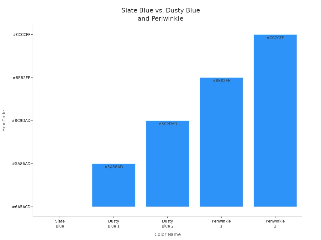
You might wonder how shades of slate blue compare to other popular colors. Dusty blue, periwinkle, and gray-blue all share some traits with slate blue, but each has its own style. Slate blue stands out because it blends blue and gray, giving a muted yet rich look. Dusty blue feels cooler and more muted, with stronger gray undertones. Periwinkle looks lighter and softer, almost pastel, and often appears more playful.
Here is a table to help you see the differences:
Color Name | Hex Code | RGB Value | Visual Description |
|---|---|---|---|
Slate Blue | #6A5ACD | RGB(106, 90, 205) | Muted, medium-toned blue with gray undertones; richer and more saturated; leans purplish blue; subdued matte appearance |
Dusty Blue 1 | #5A86AD | RGB(90, 134, 173) | Cooler, more muted, stronger gray undertones; less vibrant than slate blue |
Dusty Blue 2 | #8C9DAD | RGB(140, 157, 173) | Cooler, muted with pronounced gray undertones; less vibrant than slate blue |
Periwinkle 1 | #8E82FE | RGB(142, 130, 254) | Lighter, softer, pastel-like; delicate shade; resembles lighter version of slate blue with grayish undertones |
Periwinkle 2 | #CCCCFF | RGB(204, 204, 255) | Very light, soft pastel; more delicate than slate blue |
You can use shades of slate blue to create a modern, elegant look in any room. These shades work well with both bold and neutral colors. If you want a timeless style, try pairing shades of slate blue with white or brushed steel in your bathroom vanity or kitchen. This color family gives you many options for a calm, stylish space.
Tip: Try mixing different shades of slate blue in one room. Use lighter tones for large surfaces and darker shades for accents. This approach adds depth and interest to your design.
You can mix slate blue paint at home with a few simple steps. Start with a base of ultramarine blue or cobalt blue. These blues give you the right foundation for slate blue. Next, add a small amount of burnt umber or burnt sienna. These earth tones help mute the brightness and create the smoky, grayish look that makes slate blue unique. If you want to darken the color, add a touch of cadmium red or permanent rose. This deepens the blue without making it look muddy. To lighten the shade, mix in some titanium white. Always add colors slowly and test a small amount before mixing a large batch. This way, you can control the final shade and avoid surprises.
Tip: When you mix slate blue paint, use a palette knife for even blending. Test your color on a piece of paper before applying it to your wall or furniture.
Here is a simple step-by-step guide:
Start with ultramarine or cobalt blue.
Add a small amount of burnt umber or burnt sienna.
Mix in a touch of cadmium red or permanent rose if you want a deeper tone.
Add titanium white to lighten the color.
Mix slowly and test as you go.
You can use slate blue paint in many areas of your home. Paint your walls with slate blue for a calm and modern backdrop. This color works well in both warm and cool rooms. Many people choose slate blue paint for bathrooms to create a spa-like feeling. You can refresh a bathroom vanity or even a kitchen sink area with this color. Slate blue also looks great on dining room chairs or as an accent on radiators. If you want a cozy space, use darker shades in a den or study. Lighter shades make small rooms feel open and peaceful.
Designers often use slate blue in traditional and European country kitchens. This color pairs well with wood, terracotta, and modern fixtures. You can highlight bold colors or mellow out bright accents by adding slate blue paint to your design. Try it on cabinets, accent walls, or even fireplace surrounds for a stylish update.
Note: Slate blue paint adapts to different lighting, so it always looks fresh and elegant. Pair it with a modern wash basin or stainless steel kitchen sink for a timeless look.
A slate blue office should feel calm and modern. You can make this happen by picking the right colors. Designers often use warm earth tones like cacao, sunset coral, ochre, and sandy beige. These colors make the room feel warmer and balance the cool slate blue. You can also use soft gray, muted sage, pale blue, or golden orange for a gentle and dreamy look.
If you like more blue, try mixing slate blue with soft blues, light oak, and creamy white. Light neutrals like taupe, ivory, and beige make the office simple and welcoming. For a beachy feel, use light blues, grays, sand, and white. You can also use soft blue, walnut brown, warm tan, and plants for a natural look.
Here are some good color matches for slate blue and colors that sit next to it on the color wheel:
White and ivory: these make the room feel fresh
Yellow and orange: these add energy and stand out
Sage green and seafoam: these feel calm and natural
Deep purple and teal: these look rich and fancy
Mustard yellow and dark olive: these are bold and fit the season
You can also try using three colors together, like slate blue, soft yellow, and muted red. This mix makes your office feel lively and balanced.
Tip: Try adding a bathroom vanity or kitchen sink in a matching or different color to make your slate blue office more interesting.
There are many ways to use slate blue in your office. Many people paint the walls or floors slate blue to bring a bit of nature inside. This can help you feel happier and more relaxed at work. You might paint one wall behind your desk or use slate blue tiles for a modern style.
Lighting changes how slate blue looks in your office. The table below shows what happens to the color in different lights:
Lighting Condition | Effect on Slate Blue | Best Use in Office |
|---|---|---|
Cool LED Lighting | Makes blue tones stand out | Good for focused work |
Warm Halogen Lighting | Makes the color feel warmer | Good for cozy spaces |
Multi-layer Lighting | Balances the color and adds depth | Good for flexible spaces |
East-facing Natural Light | Makes the color softer and warmer | Good for mornings |
West-facing Natural Light | Makes the color deeper and richer | Good for evenings |
You can use slate blue on chairs, cabinets, or even a modern bathroom vanity to match your office. Try adding plants or wood to make the space feel balanced and friendly. If you want a bold look, use three colors together, like slate blue, yellow, and red.
Note: Slate blue offices look good with both old and new styles. You can change the look easily by switching out lights or decorations.
You now know that slate blue brings a calm, elegant look to any space. Designers love this color for its timeless style and easy pairing with many accents. Experts agree that soft blue shades, like slate blue, work well in both homes and offices. You can use it with a modern wash basin or a kitchen sink to create a peaceful, modern feel. Try slate blue in your next project to enjoy its lasting beauty and versatility.
You can pair slate blue with white, soft gray, or brushed steel. These colors create a modern and clean look. Try adding a sleek wash basin or a stainless steel kitchen sink from Foshan Contop Bathroom Co., Ltd. for a stylish finish.
Yes, slate blue works well in small bathrooms or kitchens. Light shades make rooms feel open and calm. You can use slate blue on walls or cabinets. Add a compact bathroom vanity to maximize space and style.
You should clean slate blue walls with a soft cloth and mild soap. Avoid harsh chemicals. Good ventilation helps prevent moisture damage. Quality paint from trusted suppliers, like Foshan Contop Bathroom Co., Ltd., keeps your color vibrant longer.
Absolutely! Slate blue looks great on kitchen cabinets, backsplashes, or even a granite kitchen sink. This color adds a modern touch and pairs well with both light and dark countertops.
Slate blue has more gray and sometimes a hint of purple. Dusty blue feels lighter and softer. You can see the difference in this table:
Color Name | Main Undertone | Mood |
|---|---|---|
Slate Blue | Gray, Blue | Calm, Rich |
Dusty Blue | Gray, Light Blue | Soft, Airy |
Tip: Use slate blue for a bold look. Choose dusty blue for a gentle, relaxed space.


